rating and reviewing my risograph works (so far)
A brief reflection of printed work I've done using the risograph, in chronological order
Spring 2022: A zine of Canal Street for a project in Integrative Studio 2
First ever risograph project. The Design Lab had reopened for first-year students to take the orientation, and I did it with a group. (The orientation has changed much since then)
I liked the concept of the project more than its execution. I didn't have time to align the prints ( I don't think i cared much about doing it actually) and didn't have much technical skill. But I think I had a strong concept, and I'm not upset at this being my first foray into it.
Final rating: 6/10 risograph alignment points
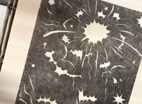
Fall 2023: Risograph class first project!
I had a more specific file set-up system that I still use to this day (thanks to my professors, Joe Hirsch and Amanda Chung). The technical use of the risograph is much better on this print than the previous project. I remember being pretty proud of it since the colors worked very effectively together to create an almost glowing, sunset-like effect
During the making of the project, I think it was my first time learning how to work with the printer and not against it. Some colours were not aligning properly, and one of the technicians said that the printer drums themselves were misaligned. As a result, the two colors, in any combination, would not be able to align properly no matter what adjustments were made, so I would have to be selective in creating the end result I wanted- what color to prioritise showing through vs losing to layers etc.
Final Rating: 8/10 Risograph Ink Saturation
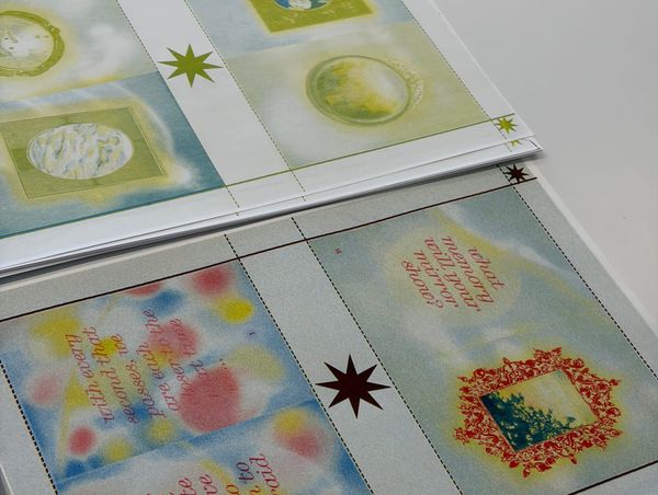
7/10: Fall 2023: Greeting Cards
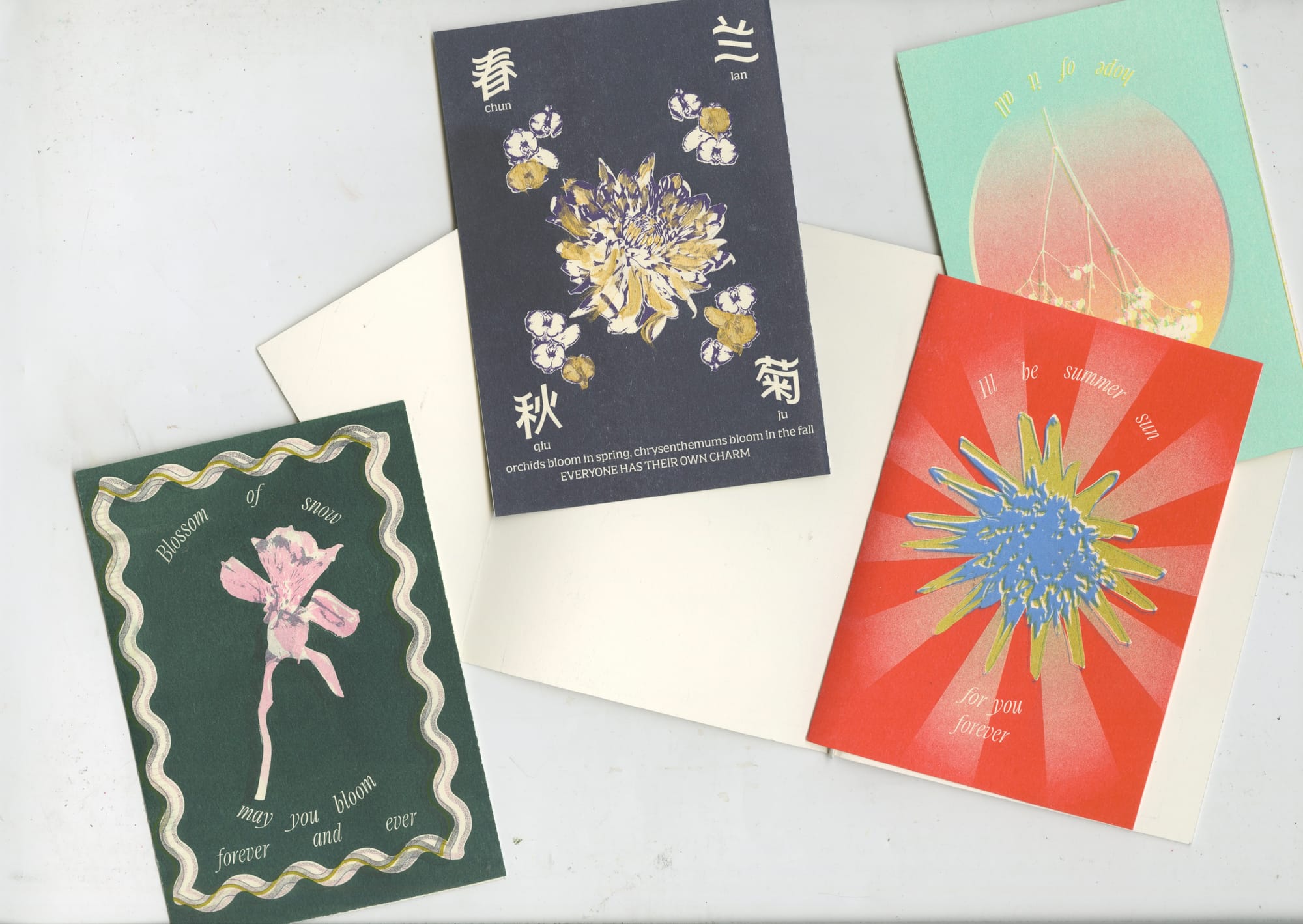
Final project for the class, created a series of bilingual greeting cards. There was a fire that led to the project being derailed. Overall, I think the color selection could have been a lot better, and more alignment was needed across the board to make the work more effective. I remember the file for the designs being especially large, since I was experimenting with using scans and detailed vector illustrations for the background gradients and frames.
I do think as a whole, it was still an effective project, since I also used a similar technique for a different project later on.
Final Rating: 7/10 master making aura points
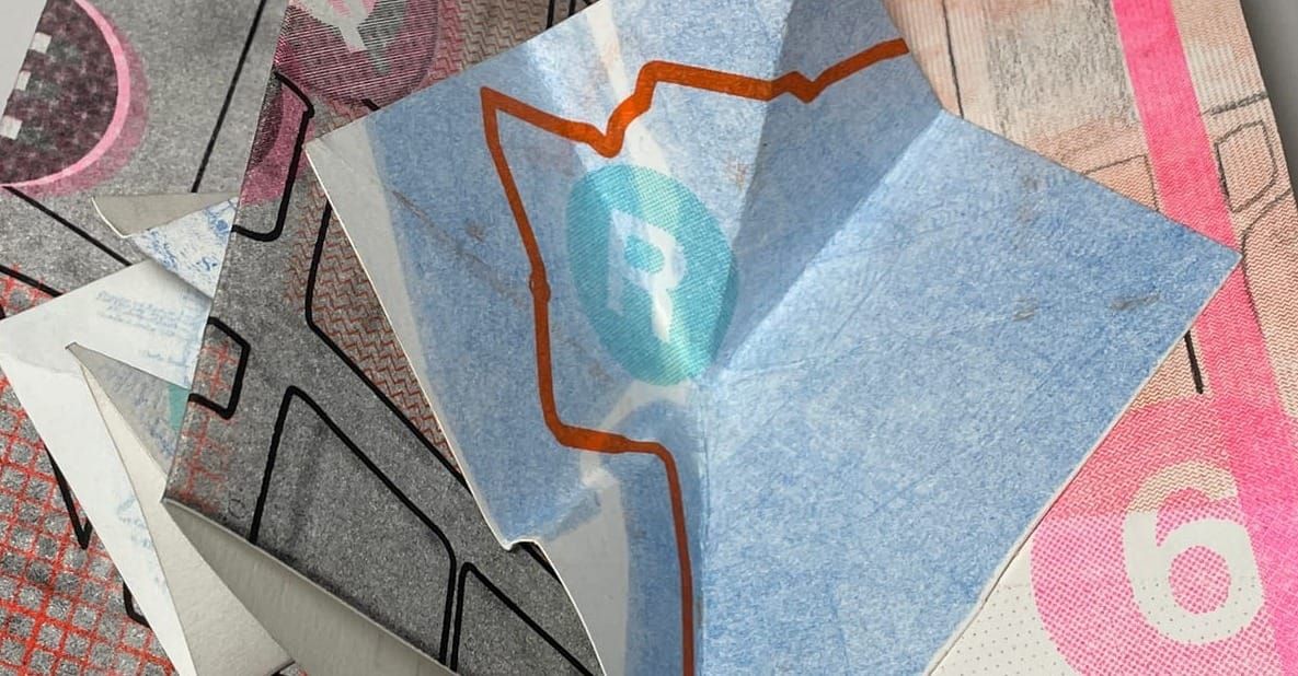
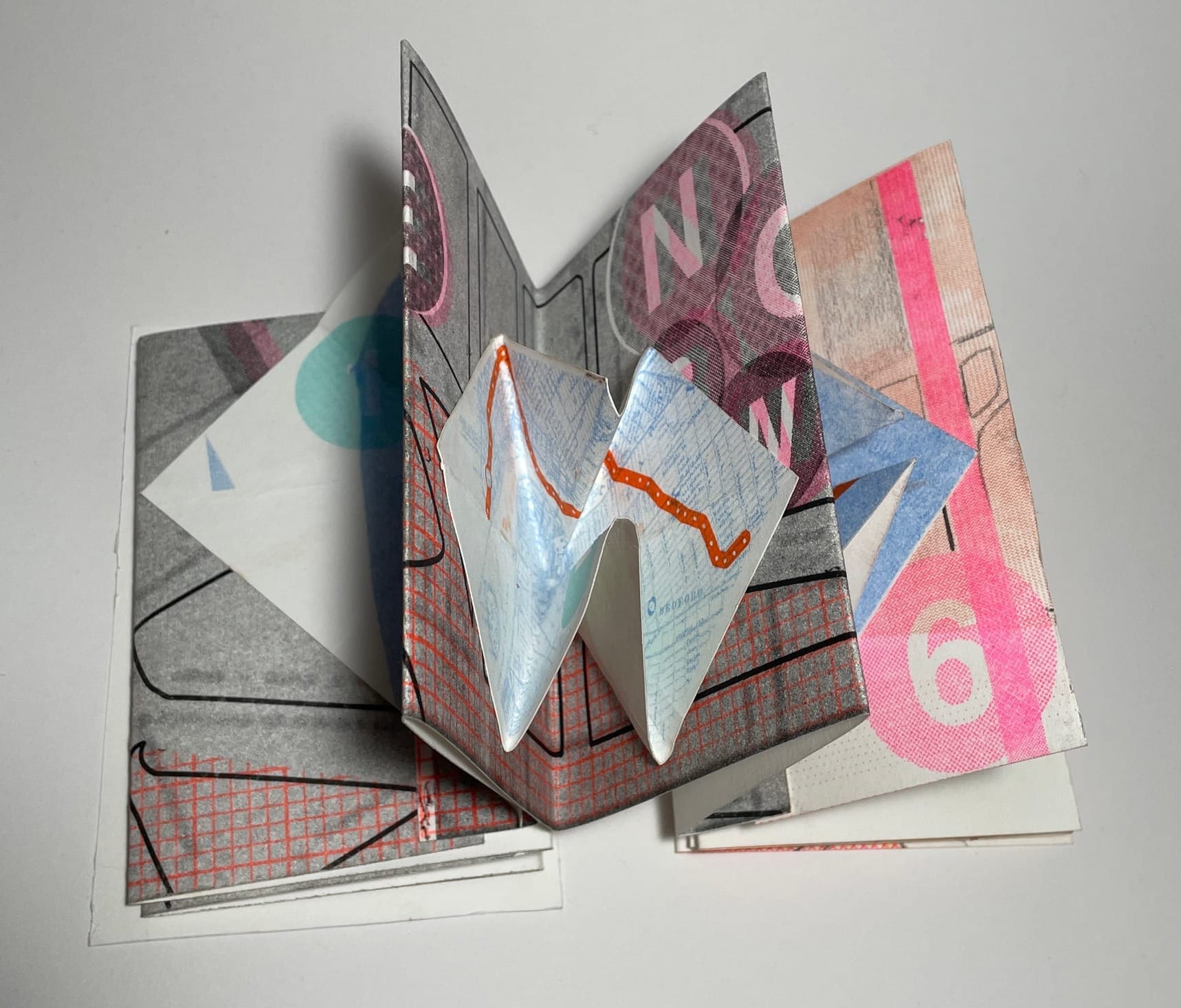
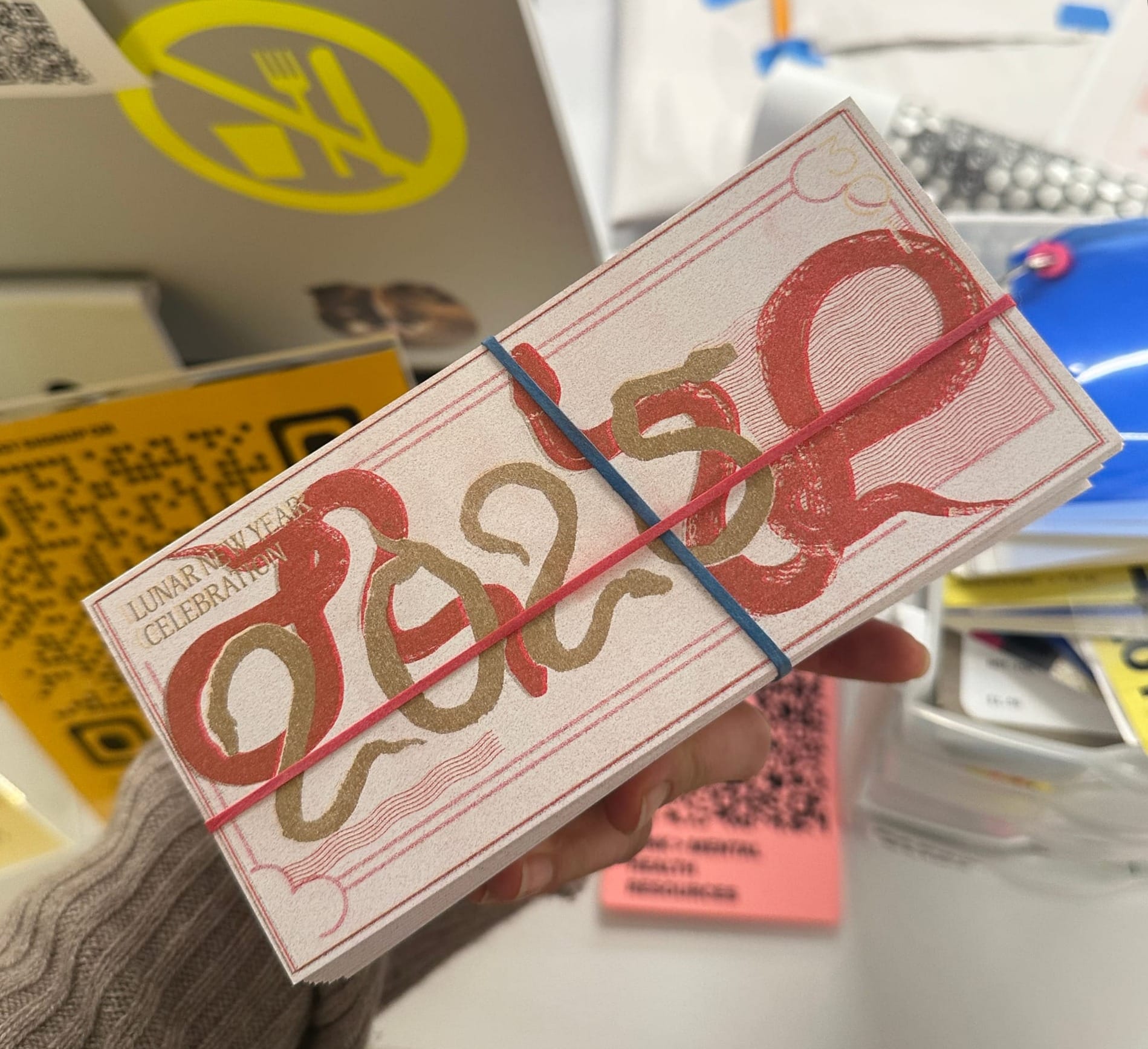
Lunar New Year 2025
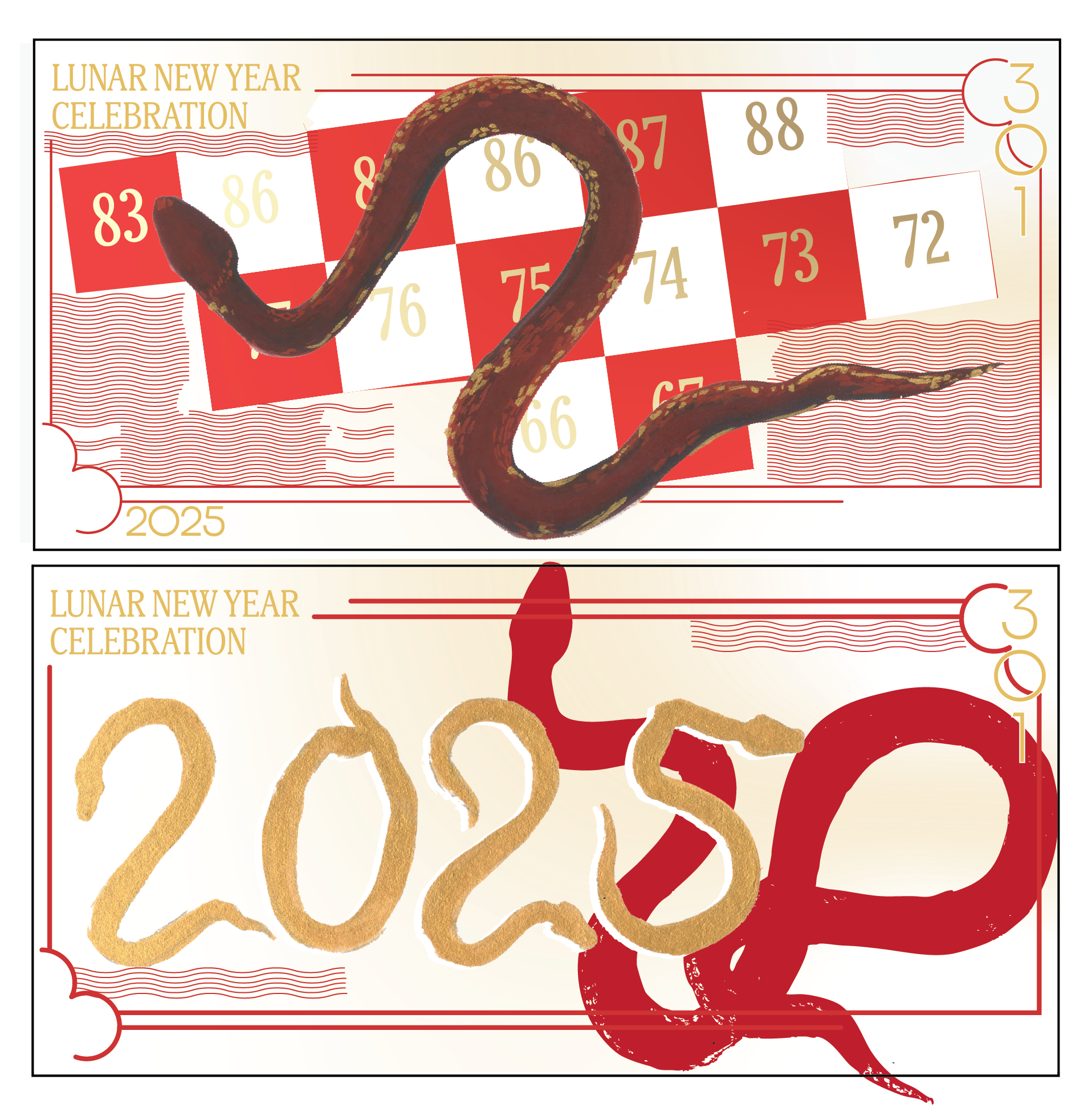
(for some reason, I don't have a photo of the print itself?)
handouts I printed for a Lunar New Year celebration for the Year of the Snake in 2025. I don't love how it turned out, but attendees were pretty happy with them, so I count that as a win. I was designing handouts in the style of currency bills for every lunar new year celebration I hosted as an RA in the dorms, since it is tradition for unmarried family members to receive money in red envelopes from older, married family members for good luck. Since I could not give out actual money ( I also did not have actual money) to give to attendees, I liked the idea of designing these bills instead.
I think the print could have been aligned better, and there could have been more utilisation of the risograph's characteristics- maybe layering more colors and textures to get a better effect. But I also did not want to put in as much effort since I was also coordinating the event's logistics, and this was just one of the many I had to work on.
Final rating: 6/10 risograph snakes
Fall 2025: Wedding Commission!
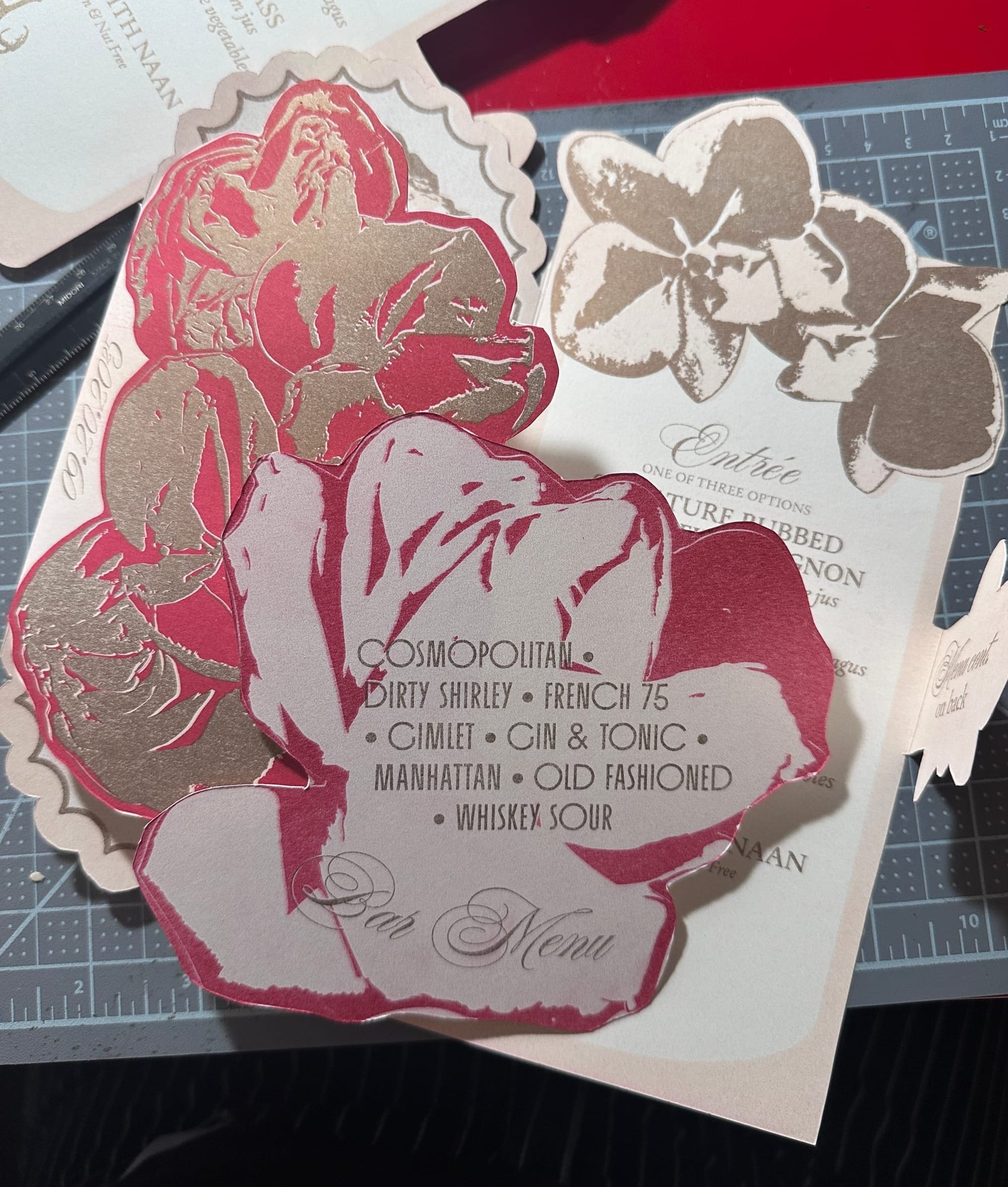
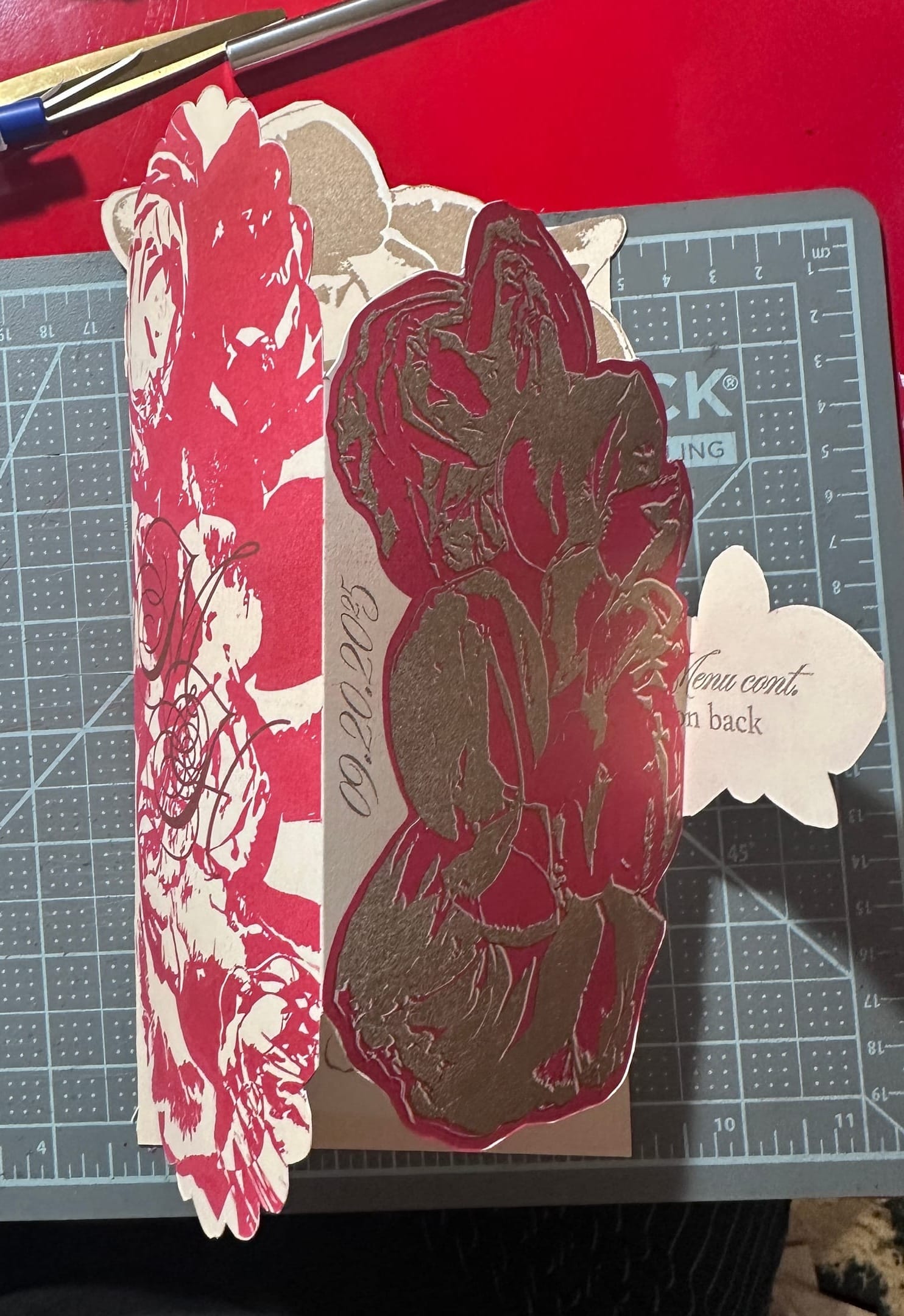
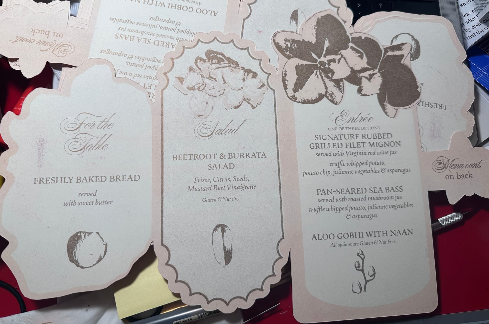
A friend was getting married and hired me to work on the printed materials that would be at the wedding! I used the risograph to print out the wedding menus (bar and food) and the wedding programs. I used the same technique as I did for the cards (ie scanning flowers and editing the scans to use in designs) and I enjoyed the challenge of experimenting with different textures to make a collection of designs cohesive.
It was stressful to do it, but I am proud I was able to do it and also very honored my work was used outside of school (for once!)
Final rating: 9/10 risograph flower petals
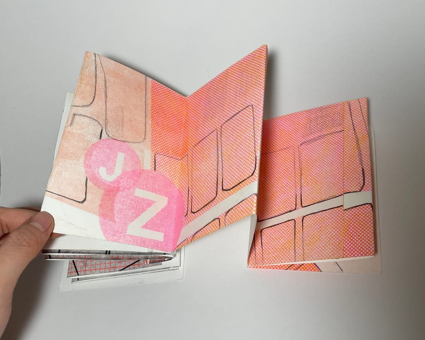
Spring 2026: Objects in the Mirror are Closer than they Appear Zine
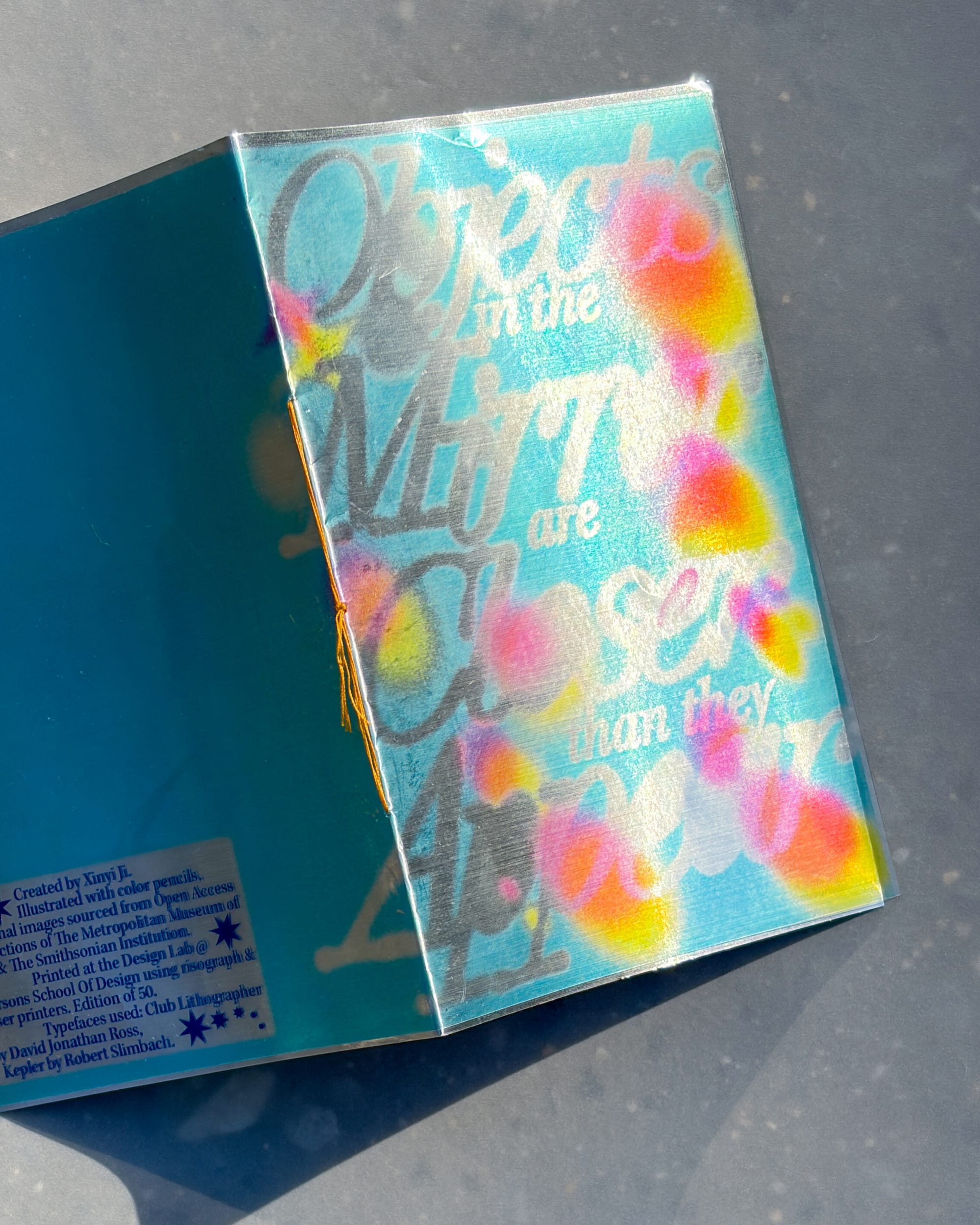
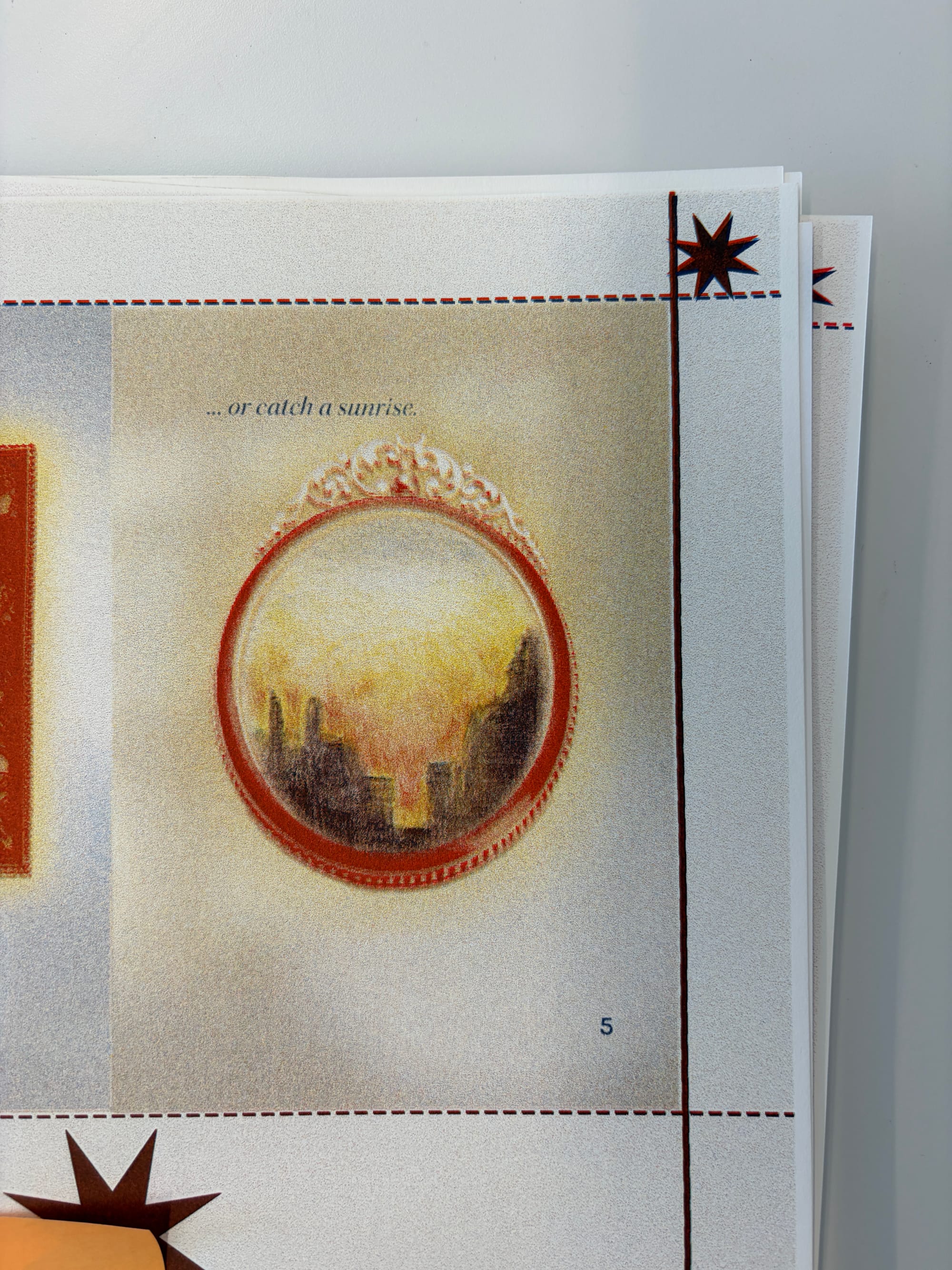
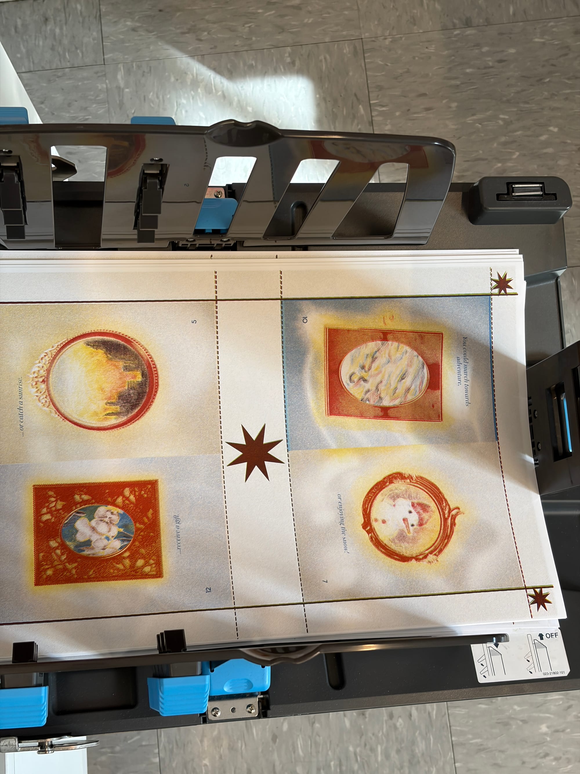
My first risographed zine! I am very proud of this project because I successfully laid out a 16-page saddle-stitched zine on the risograph, with four color spreads across all of the pages! It was a labor of love and effort (over spring break) I think the colors were used pretty successfully and got the desired, dreamy effect I wanted to achieve with the zine.
I also really liked how I used different materials for the cover to convey the concept of the zine. Also people at MoCCA liked it (and bought it!) so I guess I'm glad I'm not the only one?
Final rating: 9/10 risograph frames
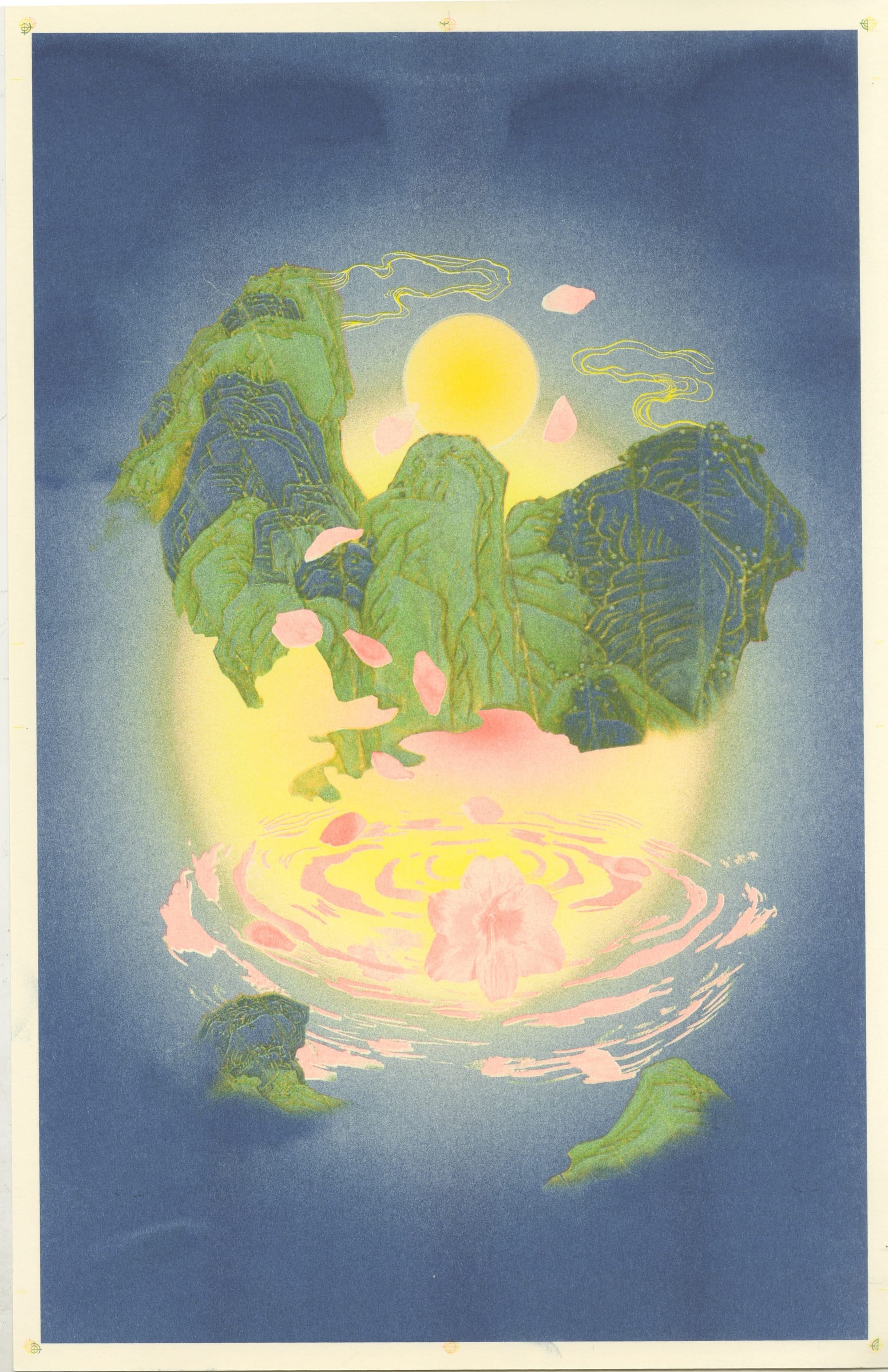
Bonus: Good Things Are Coming Prints
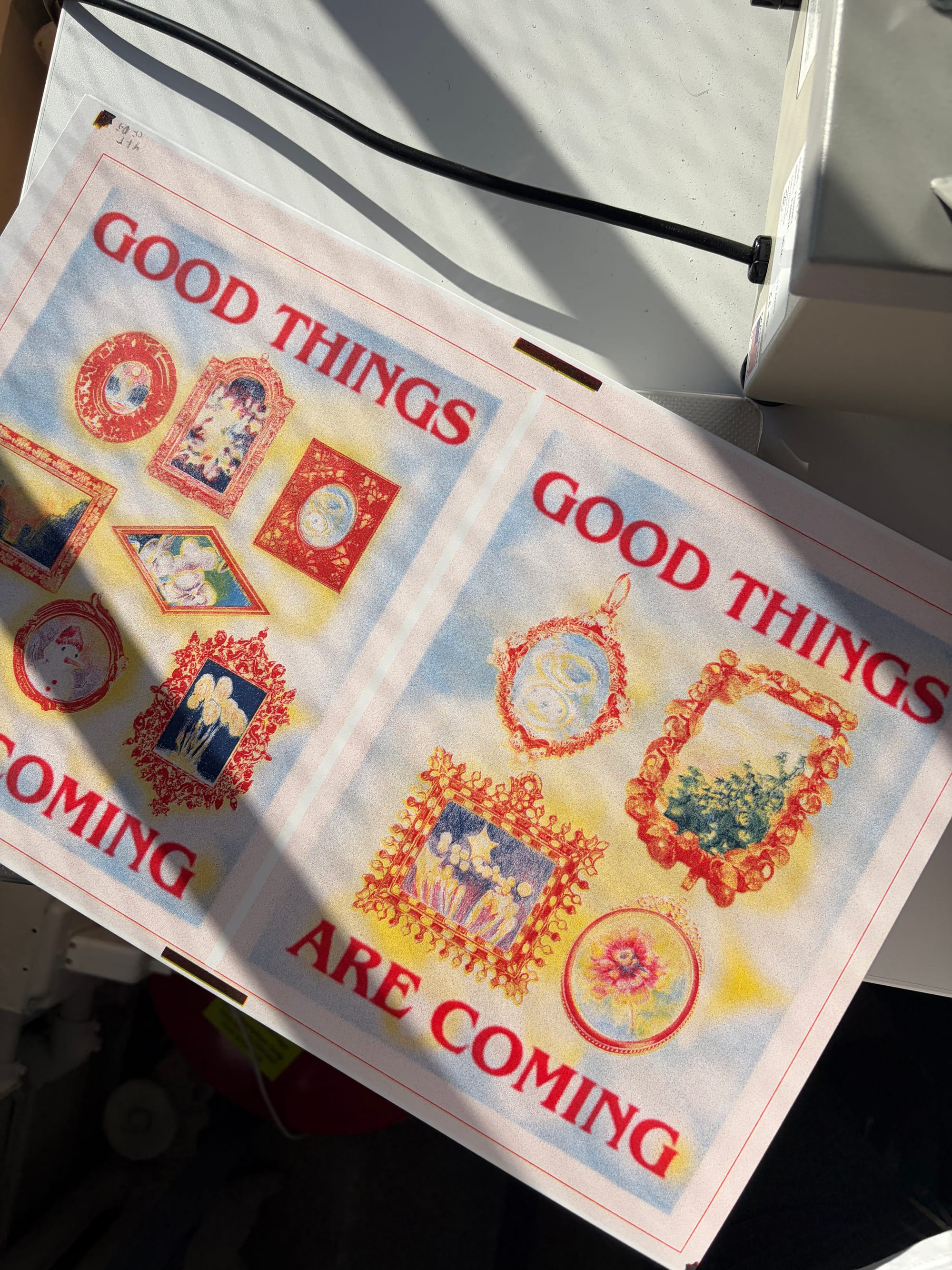
using the same illustrations from the zine, I also created prints to sell, and I think they turned out pretty well! The background colours work with the overall messaging of the prints, and I think, as a whole, both the zine and the print go well together to convey optimism in snippets of the everyday.